or
Why did you change it? What was wrong with it as it was? Where's the feedback now?
Imagine the scene... you're travelling along the motorway at 69.7mph, 315ft behind the car in front. The windscreen is getting slightly misty so you decide to use your car's blower to direct a blast of air on the windscreen. You risk a glance at the digital climate control console:
That's blowing on the windscreen and your feet.
You look for *the button*
You press it, and risk another glance at the console:
That's now blowing at the windscreen, your feet and your face; that's less effective than the last one, so you press the button again. And another glance:
Hmm, now it's not blowing on the windscreen at all. Just your feet and face. The windscreen's getting more misty now. Let's see what the button does this time:
I don't even know what this symbol means. I get feet and face, but "up"? Symbolised by an empty triangle instead of filled... still, it's not blowing on the windscreen, so let's hit the button. Again. And look. Again.
Ok, it's not pointing at your feet any more. Just your face, and "up". You sigh. The windscreen mists up even more. You press the button. Surely...
No. It's just blowing directly at your face. You wish hard, and press the button again.
At last, you now have air blowing at your windscreen.
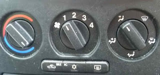
But at what potential cost? Assuming you followed the instructions above, you will have taken your eyes off the road 8 times. There's no link between a push of the button and its result. Compare this to the more traditional analogue heater/blower console:
One glance and you can see that to get air on the windscreen, you need to twist the right-hand dial 1/5 clockwise. You'll feel the 1/5 turn, you'll get instant feedback. Simple. Great UX.


I couldn't agree more. The more they try to "design" the console, the worse it gets. Originally it was designed by people who's job was "make the most important controls and most frequently used controls really easy to use", but it has now been taken over by the fluffy "emotive design" brigade and functionality is being pushed aside.
ReplyDelete